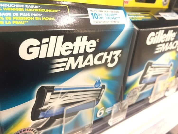
When you think of Gillette razors, sharpness immediately comes to mind. Interestingly, the Gillette logo subtly embodies this quality. At first glance, it appears to be a straightforward design, but upon closer inspection, you’ll notice hidden elements. The negative space between the “G” and the “i” forms two blade-like shapes stacked on top of each other—a clever reference to the razors produced by Gillette.

Gillette Logo


